
Looking good in photos is a skill that can be taught (hence the number of stories we've published on the subject), and one of the easiest ways to control that is what you wear. As you probably suspected, some colours look much better than others on camera, and who better to tells us exactly what they are than Lee Eiseman, the executive director at Pantone Colour Institute and author of the new book The Complete Colour Harmony, Pantone Edition?
When it comes to the worst colour to wear in photos, Eiseman told us, "Solid colours are always best, as opposed to patterns. Very pale pastels and whites can make the subject looked washed-out. However, colour in makeup can help considerably, especially professional makeup application. Cameras sometimes have difficulty adjusting between very bright contrasts, so it's best to keep brights as solid pieces as opposed to separates."
So what should you wear? Eiseman gave plenty of options for what colours to embrace, explaining that "the best colours are deep reds, teals/turquoises, and other shades in the blue-green family (the most universally flattering family of all colors). Rich and deeper greens, purples, and blue are all good. If a neutral is preferred, grey is the best, even better than black. Earthy and warm browns are good. Black and white together can offer too much contrast as well. Mid-tone or more vibrant rose-pink tones and corals are flattering."
Given your newfound knowledge of photogenic colours, you're probably ready to add some of them to your wardrobe, right? That's what we're here for.
Keep scrolling to shop pieces that will look great in photos.
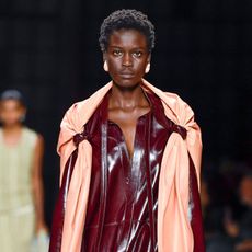
DEEP RED:

We want to wear this with high-waisted skinny jeans, hells and gold hoops.

We'd like to take all of our photos in this.
TEAL:

Trust us—you need this dress. Just add a slick of lipstick and killer heels.

Chances are you have a wedding in the diary. Wear this with a fur jacket and heels for a chic winter wonderland look.
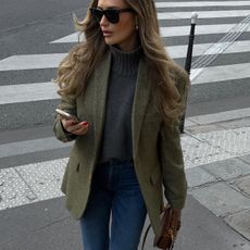
DEEP GREEN:

Keep things simple, and pair this with strappy gold heels.

Faux-fur outerwear is surprisingly versatile and we love this colour.
Related: From Dresses to Bags, I've Handpicked 21 New-In Pieces Just in Time for Payday
PURPLE:

We love the deep, rich colour and the small detailing on the low v-neck-super flattering.

Our favourite brand in our favourite colour-way.

Wear with a lighter lilac knit for a sleek tonal look.
BLUE:

This shade of blue is so dreamy.

Serious sweater goals.
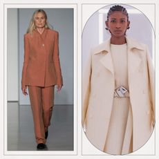
WARM BROWN:

We love how expensive this looks with an all black outfit.

The chunky ribbed trims and turtleneck make this knit feel super cosy.

Wear as styled, with the matching knit for a super sleek winter workwear look.
Related: Shop 21 of the Best Wrap Dresses, AKA the Most Flattering Things Ever
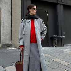
GRAY:

This will go with anything and everything in your wardrobe.

Meet your new staple.
ROSE:

Pretty pastel '70s vibes.

We can't think of a prettier way to stay warm.
Still in need of a fashion fix? Up next, our edit of winter outfit ideas.
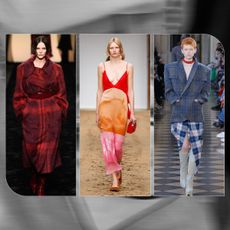
Opening image: Style Du Monde.
This post originally appeared on Who What Wear US.


-
 Butter Yellow Is Fashion's New Favourite Neutral—5 Colours It Looks Great With
Chic combinations to try.
-
 Kendall Jenner Wore the Bag Colour Trend We'll All Want to Buy in 2024
It's the new red.
-
 5 Elegant Colour Combinations That Feel So Fresh for 2024
They get more and more beautiful as you scroll.
-
 These 9 Colours Are the Centre of 2024's Biggest Fashion Trends
A fresh palette.
-
 I've Done the Research—These 6 Colours Go Exceptionally Well With Grey
Pairings you can rely on.
-
 Pantone Just Proclaimed Peach as 2024's Key Colour—5 Shades It Looks Best With
The chicest combinations.
-
 7 Winter Colour Combinations That Will Instantly Make You Look Put-Together
Your fool-proof guide.
-
 6 New Winter Print Trends That Will Elevate Your Entire Wardrobe
From colour-blocking to checkerboard.


