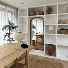
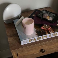
If you've ever browsed a paint catalogue, then you'll know the existential crisis that comes from having to decide between five shades of white that are totally indiscernible from each other and have names like "Savage Ground" and "Mole's Breath." This is the situation I found myself in at the end of 2020 as I moved into my new flat and was confronted with the task of choosing a new colour scheme and the accompanying homeware paraphernalia. Do I go maximalist with primary brights everywhere or stick to Scandi neutrals? Do I even bother with a "scheme" and embrace a more haphazard approach? It was hard to know where to start.
But over many weeks of scrolling and pinning, I found that there were three hues that drew my eye time and again: forest green, rust orange, and teal blue. While I certainly wouldn't consider myself a colour fanatic, I did want to include a few vibrant highlights in each room, be it a painted wall or colour-contrasting lamp. These three shades offered me just that and helped me to create, if not a theme as such, some coherence between each room.
I particularly like the effect of placing brighter pops of colour in front of more neutral walls, such as sage green and orange, pale blue and red. But one thing's for sure: It's all very much a work in progress. So if, like me, you're feeling a bit lost in the world of interior colour trends, allow me to show you the piece I'm loving right now—not a Mole's Breath in sight.
Forest Green

Style Notes: Said to be the most calming colour on the spectrum, green has been my go-to for my home-working spaces, and I plan to make it the main hue when I update my kitchen. It also looks cool when used as a pop of colour against a neutral wall.
SHOP MY EDIT


Rust Orange

Style Notes: Rust orange will probably be a bit of a marmite colour for most people, but I believe, when used in moderation, it can add some serious personality to a space. Embrace '70s styling with a statement orange pendant lamp or brighten up a white-washed living room with a velvet armchair. (I'm currently eyeing up the below from Made.com.)
SHOP MY EDIT


Teal Blue

Style Notes: It might not appear to be the most cutting-edge colour in our line-up (and yes, there is a risk it can creep into baby blue—gulp), but I find light teal blue to be a stunning colour when used in conjunction with brighter shades such as orange. Just make sure to keep silhouettes pared back to avoid things looking too cutesy.
SHOP MY EDIT


Up Next: I Just Moved Houses, and These Are the Homeware Buys I'm Obsessed With


-
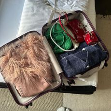 I'm a Fashion Editor Who Loves to Travel—30 Essentials I'm Packing This Year
Seriously good travel items ahead.
-
 My NYC Apartment Needs Some Serious Organizing, and These 30 Items Saved the Day
It's time to do some cleaning.
-
 Calling All Fashion Brides: These Are the *It* Bridesmaid Dress Trends to Know
Don't worry. It's nothing like 27 Dresses.
-
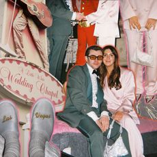 A Pink Suit, a Vintage Limo, and Plenty of Elvis: Inside My Vegas Vow Renewal
Thank you. Thank you very much.
-
 Making My Bedroom Look Peak Fashion Person Only Required These Easy Changes
An interior designer spilled some tea, and I took notes.
-
 Sydney Sweeney Just Broke My #1 Airport Dressing Rule
It's TSA approved, but still.
-
 We're Fashion Editors in NYC—We Basically Live at These 9 Hot Spots
Welcome to your stylish city guide.
-
 You Have 48 Hours in Los Angeles—Here's Your Fashion Editor–Approved Itinerary
Get your Resy app ready.


