
Right now on everyone's wish list, a phenomenal amount of leopard print is present. From the Réalisation skirt that has taken Instagram by storm this summer to Victoria Beckham's leopard-printed coat that has landed both into stores and our hearts, the fashion kingdom is currently ruled by cats. ASOS has a leopard-printed maxi dress that's selling like crazy. & Other Stories, Rixo, Ganni and Raey are all an extended part of the Réalisation skirt craze—offering up silky, slinky, billowing midis in various iterations of leopard print for those who just can't get enough.
It's the first big trend of A/W 18, but it's also one of those trends that can look cheap. There's no getting around it: Some leopard prints look expensive and some look trashy, and often that has nothing to do with the price point. I started thinking about this a few weeks ago when the Who What Wear team started calling in and experimenting with animal-printed pieces for our regular We Try Before You Buy franchise. Then, a few days later, I had a delightful lunch with the super-cool Vienna-based designer Petar Petrov, who spoke to me about how he and his team are currently on the quest for a fabulous-looking leopard fabric. Finding a chic, top-quality, expensive-looking leopard print is really tough for designers. And when a trend explodes like this—with high-street stores fast to act upon it—there will be some bad versions lurking out there. But how can we define the bad from the good? I reached out to some experts—a print-designer friend, the WWW crew and the clever girls at Rixo London—to get to the bottom of it.
1. Fabric composition is key
"When investing in leopard-printed pieces, the top priority should be material composition. The type of fabric the print is placed on is key!" explain Orlagh McCloskey and Henrietta Rix, co-founders and creative directors of Rixo London. "Our prints are completely hand painted by us, and after this, we scan our paintings into a digital format so it can be digitally printed on to the material. To ensure the best finish for our leopard-printed pieces, we tend to use mostly high-quality natural fabrics—such as silk—that will stand the test of time."
There you have it: Silks, cottons and blends that have a relatively matte finish and zero stretch are most luxe-looking in 2018.
2. What looks expensive and cheap changes with the era
For some reason, what appears to look most expensive right now is not a leopard print that is super-detailed and made to look realistic. Something that is more simplistic and cartoonish is de rigueur. A while ago, when digital prints were really coming into their own, a more realistic animal pattern was desired, but the graphic nature of this new wave works particularly well across social media. Why? Well, because of the instant visual impact. Petrov agrees, informing me that overworked leopard prints can look dated.
In addition, you'll notice that scale is key: Medium-sized leopard spots are winning out against smaller ocelot dots or jumbo leopard.
3. Generic leopard prints look generic
A talented print-designer friend of mine tells me it's obvious when a brand has just picked up a standard leopard print you could find in any other store. "A more elevated animal print will have been worked into by a print designer and most likely have some sort of twist to make it feel more interesting and less generic. This could be in the actual design of the print or the colourway, feeling more premium and tasteful," she says. Suppliers creating these prints could be tapped by multiple high-street brands, leading to multiple stores stocking the exact same, lesser-quality fabrics. No one wants that.
4. Neutral colours or super brights are most on-trend
Just like the way we've seen more cartoonish prints coming to the fore, it's also obvious that the colour palettes involved are key: Super-neutral and quite beige-toned leopard prints are most popular (rather than the orangey or yellowy versions of the 1980s, for example). If not neutral, then it's about going full-on high-octane for something in orange, red or bright green. Tom Ford's über-luxury, über-flashy outlook for A/W 18 really leads this charge, but you'll find affordable, expensive-looking versions at the likes of Topshop too.
Related: 11 Pairs of Leopard-Print Shoes You Can Wear 365 Days a Year
5. You shouldn't be able to see the repetition of the pattern
If you can see where the "tile" of the leopard print starts and finishes, you have yourself a dead giveaway for a cheaply designed print.
In addition, you need to ensure the finish looks sharp—anything blurry means the printing quality might not be great and that also the resolution of the artwork wasn't high enough. These details count, and even if you're investing in a high-street piece, many affordable stores will have a designer dedicated to ensuring quality control.
6. The item's silhouette needs to feel current
It's all well and good having the right fabric, but if it's used in a shape that feels less of-the-moment, your leopard item could still look slightly off-key. For example, tight-fitting jersey maxi skirts aren't particularly trendy right now, so a leopard version of that will not look as "right" as a leopard midi slip skirt. Or a V-neck tee might seem less favourable than a neat wrap blouse. Get it?
Shop Expensive-Looking Leopard-Printed Pieces

This also comes in a skirt, dress and more.

Okay, it is expensive, but look at how perfect it is.

My personal dream ticket.

This one won't stay in stock for long.

So cute.

Office-appropriate, right?

This is super luxe and has a friendly price tag.

Our fave. Stand by for a restock.

We love the colours here.

A very elegant dash of leo.

Very cool with jeans.

Tuck in a shirt and add heels.

Come to momma.

It's sold out for now, but we're hopeful it's coming back.

Nobody would guess these are under £50.
Next, see the items our editors have gotten the most wear out of.


-
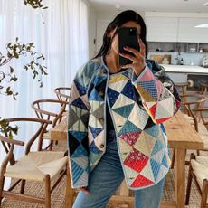 The Only 9 Jackets You Need for Spring, According to Fashion People
There's something for everyone.
-
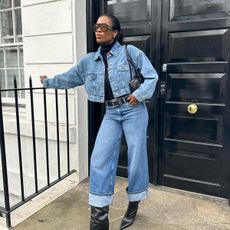 And Now, 5 Elevated Ways to Wear Your Jeans in 2024
Denim devotees, unite.
-
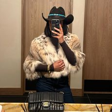 After 5 Days in Aspen, I'm Officially Hooked on Western Pieces—5 I'm Loving RN
From cowboy hats to fringe accents.
-
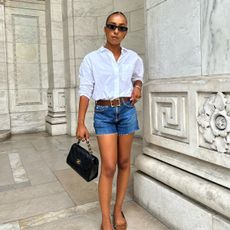 I Asked Over 2000 Women Where to Buy the Best White Shirts—They Love These 23
Your definitive guide.
-
 Here's How French Women Are Styling Their Jeans Right Now
Take note.
-
 French Women Always Wear This Jeans-and-Flats Outfit Formula
Easy as un, deux, trois.
-
 I Went to France and Saw Everyone Wearing These 5 Basics on the Streets of Paris
Effortless and chic.
-
 French Girls Laugh Every Time Americans Wear These 3 Things
Intrigued?


